WEKID™ · Independent Framework Authority
Brand & Wordmark Guidelines
Identity standards for partners, licensees, and the WEKID ecosystem.
01 — The wordmark
One mark. The whole framework.
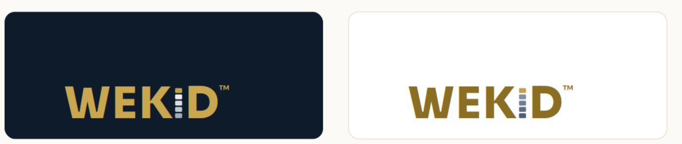
The WEKID wordmark is the primary and preferred identity. Its letter “I” is built from the five-tier epistemic stack — Data at the base rising to Wisdom at the gold apex — so the framework lives inside the logotype itself. No separate symbol is required.
02 — Colorways & lockups
Tuned for every background.
Two colorways, each built for its own ground. Gold reaches full contrast on Ink; on light grounds the apex drops to Antique Gold so the mark stays readable.
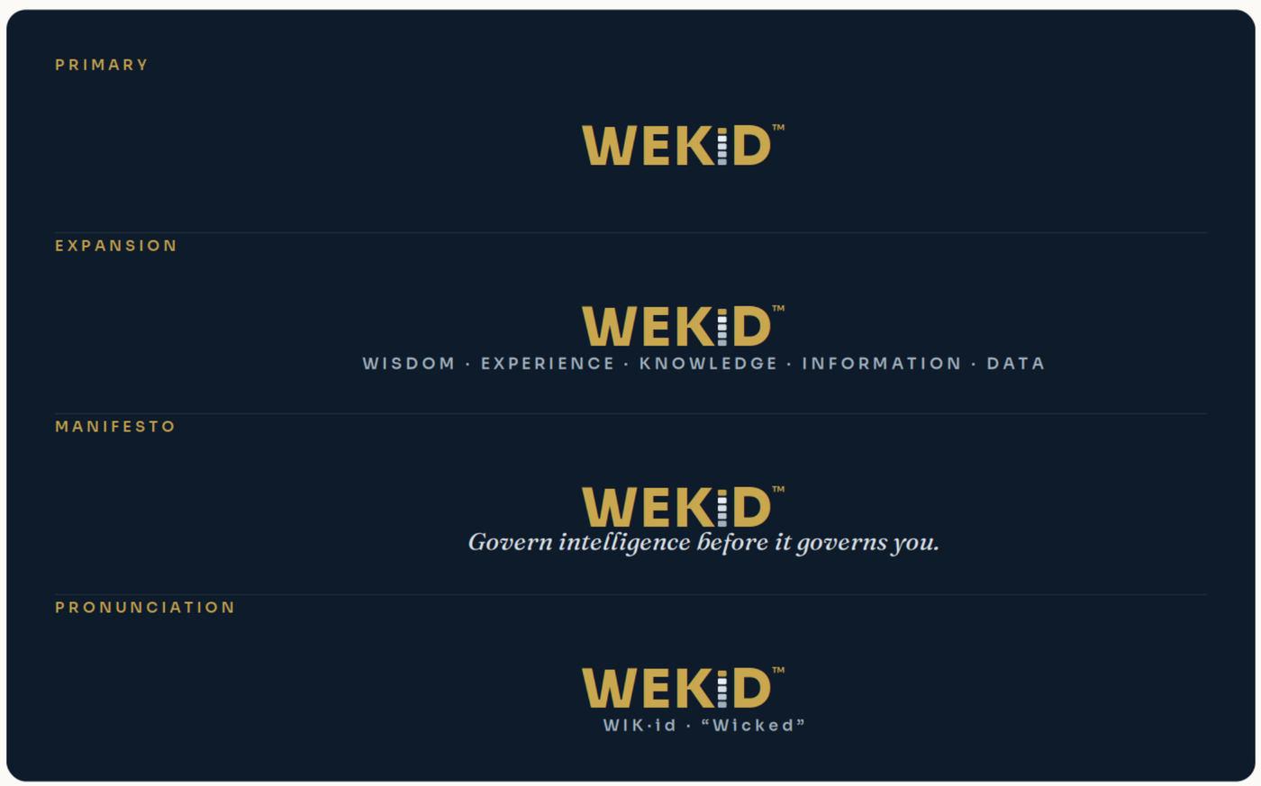
When to use which
Primary — default, and the only one below 220 px wide.
Expansion — first use in a document, or where the five tiers need naming.
Manifesto — covers, title slides, and campaign surfaces.
Pronunciation — introductions, conference material, and anywhere
“WEKID” is being said aloud for the first time. It is pronounced
WIK·id — “Wicked.”
03 — Clear space & sizing
Give it room. Keep it readable.
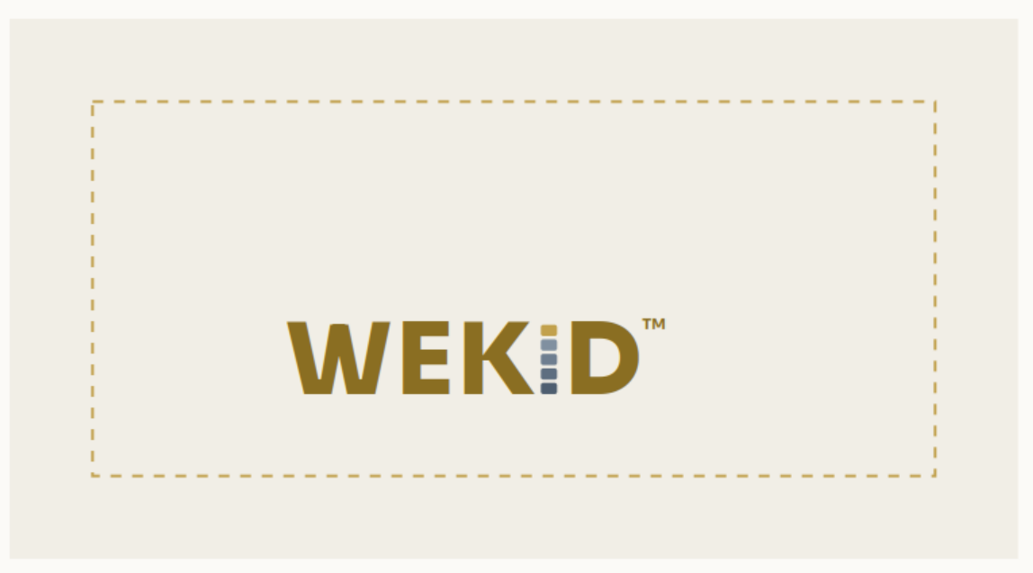
Maintain padding on all sides equal to the height of the “I” glyph (one stack height). Keep that area free of text, images, and other logos.
Minimum sizes
| Lockup | Minimum width | Why |
|---|---|---|
| Primary wordmark | ≥ 120 px / 1.25 in | Below this the stack tiers close up. |
| Tagline lockups | ≥ 220 px / 2.25 in | Below this the tagline loses legibility — use the primary. |
04 — Color & type
The palette and the voices.
Print: match Gold to ~Pantone 871/872 (metallic) or 458 C (flat). Click any value to copy it.
The stack tiers
The five tiers of the “I” are a ramp, not one color. Data sits at the base and Wisdom at the apex, and the apex is the same gold in both colorways.
Where these values come from
Taken from the vector masters in the brand kit, which are what the mark is actually drawn with. The palette page of the v1.0 PDF stated two of them differently — #8A6E22 for the light-ground letters rather than #8A6D18, and a single Slate rather than the two ramps above. This version corrects that, and both this document and the web page are now generated from one source so they cannot diverge again.
Contrast, so the palette is used safely
Measured against WCAG 2.1 AA — 4.5:1 for body text, 3:1 for large text (18 pt / 24 px, or 14 pt bold and above). This is the arithmetic behind “don’t use bright gold on white.”
| Combination | Ratio | Safe for |
|---|---|---|
| Ink on Paper | 16.64:1 | Body text and large |
| Antique Gold #8A6D18 on Paper | 4.70:1 | Body text and large |
| Darkest slate tier on Paper | 8.20:1 | Body text and large |
| Gold apex #C2A14D on Paper | 2.37:1 | Not for text |
| Paper on Ink | 16.64:1 | Body text and large |
| Gold, dark #C9A74F on Ink | 7.55:1 | Body text and large |
| Gold apex #C2A14D on Ink | 7.03:1 | Body text and large |
| Darkest platinum tier on Ink | 7.78:1 | Body text and large |
The short version: the gold apex is a fixed constant. The letters change with the ground — #8A6D18 on paper, #C9A74F on ink — and the one thing never to do is set the apex gold as type on a light background.
Typefaces
Govern intelligence.
Govern intelligence before it governs you.
All three are open-licensed and available from Google Fonts.
05 — Usage
Do, don’t, and where to get files.
Don’t
- ×Recolor the letters off-palette
- ×Add shadows, glows, or outlines
- ×Stretch, condense, or rotate
- ×Reorder or recolor the stack tiers
- ×Set bright gold as type on white
- ×Substitute the typeface
Asset library
Everything in this document in one file: the vector masters with type outlined so no font is needed, 1800 px lockups for all four variants in both colorways, 300 px transparent icons, the favicon, this guidance as a PDF, and a README carrying the palette and the permitted-use terms.
Download the WEKID Brand Kit · ZIP, 0.5 MB ↓
Questions or special-use approvals:
brand@wekid.org
© 2026 WEKID LLC. All rights reserved. WEKID™ is a trademark of WEKID LLC.
06 — Permitted use
What you may call your work.
These guidelines govern how the mark is drawn. A separate question is whether you may use the name at all — and for most uses, the answer is yes, with no permission needed.
Free, no permission needed
Describing what your work does with WEKID: “supports WEKID,” “based on the WEKID framework,” “implements the Epistemic Maturity Model.” Teaching or writing about the framework. Citing the models and layers in your own documentation, research, or product. Building a commercial product on the published framework.
Requires a trademark license
Claiming that an implementation meets the standard — “WEKID-conformant,” “WEKID Certified.” Using the mark or badge in product branding. Offering WEKID certification or training as an authorized partner.
Conformance claims require passing the published conformance criteria. That is the only gate, and the criteria are public — so it is a test, not a gatekeeper.
Full permitted-use terms →The framework itself is openly published. These brand rules exist to stop a non-conformant implementation being sold as the real thing — not to restrict who may read, teach, or build on WEKID.